Showing posts with label causation. Show all posts
Showing posts with label causation. Show all posts
Monday, 12 February 2024
Sunday, 13 September 2020
Statistics, lies and the virus: Five lessons from a pandemic
In an age of disinformation, the value of rigorous data has never been more evident writes Tim Harford in The FT
Will this year be 1954 all over again? Forgive me, I have become obsessed with 1954, not because it offers another example of a pandemic (that was 1957) or an economic disaster (there was a mild US downturn in 1953), but for more parochial reasons.
Will this year be 1954 all over again? Forgive me, I have become obsessed with 1954, not because it offers another example of a pandemic (that was 1957) or an economic disaster (there was a mild US downturn in 1953), but for more parochial reasons.
Nineteen fifty-four saw the appearance of two contrasting visions for the world of statistics — visions that have shaped our politics, our media and our health. This year confronts us with a similar choice.
The first of these visions was presented in How to Lie with Statistics, a book by a US journalist named Darrell Huff. Brisk, intelligent and witty, it is a little marvel of numerical communication.
The book received rave reviews at the time, has been praised by many statisticians over the years and is said to be the best-selling work on the subject ever published. It is also an exercise in scorn: read it and you may be disinclined to believe a number-based claim ever again.
There are good reasons for scepticism today. David Spiegelhalter, author of last year’s The Art of Statistics, laments some of the UK government’s coronavirus graphs and testing targets as “number theatre”, with “dreadful, awful” deployment of numbers as a political performance.
“There is great damage done to the integrity and trustworthiness of statistics when they’re under the control of the spin doctors,” Spiegelhalter says. He is right. But we geeks must be careful — because the damage can come from our own side, too.
For Huff and his followers, the reason to learn statistics is to catch the liars at their tricks. That sceptical mindset took Huff to a very unpleasant place, as we shall see. Once the cynicism sets in, it becomes hard to imagine that statistics could ever serve a useful purpose.
But they can — and back in 1954, the alternative perspective was embodied in the publication of an academic paper by the British epidemiologists Richard Doll and Austin Bradford Hill. They marshalled some of the first compelling evidence that smoking cigarettes dramatically increases the risk of lung cancer.
The data they assembled persuaded both men to quit smoking and helped save tens of millions of lives by prompting others to do likewise. This was no statistical trickery, but a contribution to public health that is almost impossible to exaggerate.
You can appreciate, I hope, my obsession with these two contrasting accounts of statistics: one as a trick, one as a tool. Doll and Hill’s painstaking approach illuminates the world and saves lives into the bargain.
Huff’s alternative seems clever but is the easy path: seductive, addictive and corrosive. Scepticism has its place, but easily curdles into cynicism and can be weaponized into something even more poisonous than that.
The two worldviews soon began to collide. Huff’s How to Lie with Statistics seemed to be the perfect illustration of why ordinary, honest folk shouldn’t pay too much attention to the slippery experts and their dubious data.
Such ideas were quickly picked up by the tobacco industry, with its darkly brilliant strategy of manufacturing doubt in the face of evidence such as that provided by Doll and Hill.
As described in books such as Merchants of Doubt by Erik Conway and Naomi Oreskes, this industry perfected the tactics of spreading uncertainty: calling for more research, emphasising doubt and the need to avoid drastic steps, highlighting disagreements between experts and funding alternative lines of inquiry. The same tactics, and sometimes even the same personnel, were later deployed to cast doubt on climate science.
These tactics are powerful in part because they echo the ideals of science. It is a short step from the Royal Society’s motto, “nullius in verba” (take nobody’s word for it), to the corrosive nihilism of “nobody knows anything”.
So will 2020 be another 1954? From the point of view of statistics, we seem to be standing at another fork in the road. The disinformation is still out there, as the public understanding of Covid-19 has been muddied by conspiracy theorists, trolls and government spin doctors.
Yet the information is out there too. The value of gathering and rigorously analysing data has rarely been more evident. Faced with a complete mystery at the start of the year, statisticians, scientists and epidemiologists have been working miracles. I hope that we choose the right fork, because the pandemic has lessons to teach us about statistics — and vice versa — if we are willing to learn.
The numbers matter
“One lesson this pandemic has driven home to me is the unbelievable importance of the statistics,” says Spiegelhalter. Without statistical information, we haven’t a hope of grasping what it means to face a new, mysterious, invisible and rapidly spreading virus.
Once upon a time, we would have held posies to our noses and prayed to be spared; now, while we hope for advances from medical science, we can also coolly evaluate the risks.
Without good data, for example, we would have no idea that this infection is 10,000 times deadlier for a 90-year-old than it is for a nine-year-old — even though we are far more likely to read about the deaths of young people than the elderly, simply because those deaths are surprising. It takes a statistical perspective to make it clear who is at risk and who is not.
Good statistics, too, can tell us about the prevalence of the virus — and identify hotspots for further activity. Huff may have viewed statistics as a vector for the dark arts of persuasion, but when it comes to understanding an epidemic, they are one of the few tools we possess.
Don’t take the numbers for granted
But while we can use statistics to calculate risks and highlight dangers, it is all too easy to fail to ask the question “Where do these numbers come from?” By that, I don’t mean the now-standard request to cite sources, I mean the deeper origin of the data. For all his faults, Huff did not fail to ask the question.
He retells a cautionary tale that has become known as “Stamp’s Law” after the economist Josiah Stamp — warning that no matter how much a government may enjoy amassing statistics, “raise them to the nth power, take the cube root and prepare wonderful diagrams”, it was all too easy to forget that the underlying numbers would always come from a local official, “who just puts down what he damn pleases”.
The cynicism is palpable, but there is insight here too. Statistics are not simply downloaded from an internet database or pasted from a scientific report. Ultimately, they came from somewhere: somebody counted or measured something, ideally systematically and with care. These efforts at systematic counting and measurement require money and expertise — they are not to be taken for granted.
In my new book, How to Make the World Add Up, I introduce the idea of “statistical bedrock” — data sources such as the census and the national income accounts that are the results of painstaking data collection and analysis, often by official statisticians who get little thanks for their pains and are all too frequently the target of threats, smears or persecution.
In Argentina, for example, long-serving statistician Graciela Bevacqua was ordered to “round down” inflation figures, then demoted in 2007 for producing a number that was too high. She was later fined $250,000 for false advertising — her crime being to have helped produce an independent estimate of inflation.
In 2011, Andreas Georgiou was brought in to head Greece’s statistical agency at a time when it was regarded as being about as trustworthy as the country’s giant wooden horses. When he started producing estimates of Greece’s deficit that international observers finally found credible, he was prosecuted for his “crimes” and threatened with life imprisonment. Honest statisticians are braver — and more invaluable — than we know.
In the UK, we don’t habitually threaten our statisticians — but we do underrate them. “The Office for National Statistics is doing enormously valuable work that frankly nobody has ever taken notice of,” says Spiegelhalter, pointing to weekly death figures as an example. “Now we deeply appreciate it.”
Quite so. This statistical bedrock is essential, and when it is missing, we find ourselves sinking into a quagmire of confusion.
The foundations of our statistical understanding of the world are often gathered in response to a crisis. For example, nowadays we take it for granted that there is such a thing as an “unemployment rate”, but a hundred years ago nobody could have told you how many people were searching for work. Severe recessions made the question politically pertinent, so governments began to collect the data.
More recently, the financial crisis hit. We discovered that our data about the banking system was patchy and slow, and regulators took steps to improve it.
So it is with the Sars-Cov-2 virus. At first, we had little more than a few data points from Wuhan, showing an alarmingly high death rate of 15 per cent — six deaths in 41 cases. Quickly, epidemiologists started sorting through the data, trying to establish how exaggerated that case fatality rate was by the fact that the confirmed cases were mostly people in intensive care. Quirks of circumstance — such as the Diamond Princess cruise ship, in which almost everyone was tested — provided more insight.
Johns Hopkins University in the US launched a dashboard of data resources, as did the Covid Tracking Project, an initiative from the Atlantic magazine. An elusive and mysterious threat became legible through the power of this data.
That is not to say that all is well. Nature recently reported on “a coronavirus data crisis” in the US, in which “political meddling, disorganization and years of neglect of public-health data management mean the country is flying blind”.
Nor is the US alone. Spain simply stopped reporting certain Covid deaths in early June, making its figures unusable. And while the UK now has an impressively large capacity for viral testing, it was fatally slow to accelerate this in the critical early weeks of the pandemic.
Ministers repeatedly deceived the public about the number of tests being carried out by using misleading definitions of what was happening. For weeks during lockdown, the government was unable to say how many people were being tested each day.
Huge improvements have been made since then. The UK’s Office for National Statistics has been impressively flexible during the crisis, for example in organising systematic weekly testing of a representative sample of the population. This allows us to estimate the true prevalence of the virus. Several countries, particularly in east Asia, provide accessible, usable data about recent infections to allow people to avoid hotspots.
These things do not happen by accident: they require us to invest in the infrastructure to collect and analyse the data. On the evidence of this pandemic, such investment is overdue, in the US, the UK and many other places.
Even the experts see what they expect to see
Jonas Olofsson, a psychologist who studies our perceptions of smell, once told me of a classic experiment in the field. Researchers gave people a whiff of scent and asked them for their reactions to it. In some cases, the experimental subjects were told: “This is the aroma of a gourmet cheese.” Others were told: “This is the smell of armpits.”
In truth, the scent was both: an aromatic molecule present both in runny cheese and in bodily crevices. But the reactions of delight or disgust were shaped dramatically by what people expected.
Statistics should, one would hope, deliver a more objective view of the world than an ambiguous aroma. But while solid data offers us insights we cannot gain in any other way, the numbers never speak for themselves. They, too, are shaped by our emotions, our politics and, perhaps above all, our preconceptions.
A striking example is the decision, on March 23 this year, to introduce a lockdown in the UK. In hindsight, that was too late.
“Locking down a week earlier would have saved thousands of lives,” says Kit Yates, author of The Maths of Life and Death — a view now shared by influential epidemiologist Neil Ferguson and by David King, chair of the “Independent Sage” group of scientists.
The logic is straightforward enough: at the time, cases were doubling every three to four days. If a lockdown had stopped that process in its tracks a week earlier, it would have prevented two doublings and saved three-quarters of the 65,000 people who died in the first wave of the epidemic, as measured by the excess death toll.
That might be an overestimate of the effect, since people were already voluntarily pulling back from social interactions. Yet there is little doubt that if a lockdown was to happen at all, an earlier one would have been more effective. And, says Yates, since the infection rate took just days to double before lockdown but long weeks to halve once it started, “We would have got out of lockdown so much sooner . . . Every week before lockdown cost us five to eight weeks at the back end of the lockdown.”
Why, then, was the lockdown so late? No doubt there were political dimensions to that decision, but senior scientific advisers to the government seemed to believe that the UK still had plenty of time. On March 12, prime minister Boris Johnson was flanked by Chris Whitty, the government’s chief medical adviser, and Patrick Vallance, chief scientific adviser, in the first big set-piece press conference. Italy had just suffered its 1,000th Covid death and Vallance noted that the UK was about four weeks behind Italy on the epidemic curve.
With hindsight, this was wrong: now that late-registered deaths have been tallied, we know that the UK passed the same landmark on lockdown day, March 23, just 11 days later.
It seems that in early March the government did not realise how little time it had. As late as March 16, Johnson declared that infections were doubling every five to six days.
The trouble, says Yates, is that UK data on cases and deaths suggested that things were moving much faster than that, doubling every three or four days — a huge difference. What exactly went wrong is unclear — but my bet is that it was a cheese-or-armpit problem.
Some influential epidemiologists had produced sophisticated models suggesting that a doubling time of five to six days seemed the best estimate, based on data from the early weeks of the epidemic in China. These models seemed persuasive to the government’s scientific advisers, says Yates: “If anything, they did too good a job.”
Yates argues that the epidemiological models that influenced the government’s thinking about doubling times were sufficiently detailed and convincing that when the patchy, ambiguous, early UK data contradicted them, it was hard to readjust. We all see what we expect to see.
The result, in this case, was a delay to lockdown: that led to a much longer lockdown, many thousands of preventable deaths and needless extra damage to people’s livelihoods. The data is invaluable but, unless we can overcome our own cognitive filters, the data is not enough.
The best insights come from combining statistics with personal experience
The expert who made the biggest impression on me during this crisis was not the one with the biggest name or the biggest ego. It was Nathalie MacDermott, an infectious-disease specialist at King’s College London, who in mid-February calmly debunked the more lurid public fears about how deadly the new coronavirus was.
Then, with equal calm, she explained to me that the virus was very likely to become a pandemic, that barring extraordinary measures we could expect it to infect more than half the world’s population, and that the true fatality rate was uncertain but seemed to be something between 0.5 and 1 per cent. In hindsight, she was broadly right about everything that mattered. MacDermott’s educated guesses pierced through the fog of complex modelling and data-poor speculation.
I was curious as to how she did it, so I asked her. “People who have spent a lot of their time really closely studying the data sometimes struggle to pull their head out and look at what’s happening around them,” she said. “I trust data as well, but sometimes when we don’t have the data, we need to look around and interpret what’s happening.”
MacDermott worked in Liberia in 2014 on the front line of an Ebola outbreak that killed more than 11,000 people. At the time, international organisations were sanguine about the risks, while the local authorities were in crisis. When she arrived in Liberia, the treatment centres were overwhelmed, with patients lying on the floor, bleeding freely from multiple areas and dying by the hour.
The horrendous experience has shaped her assessment of subsequent risks: on the one hand, Sars-Cov-2 is far less deadly than Ebola; on the other, she has seen the experts move too slowly while waiting for definitive proof of a risk.
“From my background working with Ebola, I’d rather be overprepared than underprepared because I’m in a position of denial,” she said.
There is a broader lesson here. We can try to understand the world through statistics, which at their best provide a broad and representative overview that encompasses far more than we could personally perceive. Or we can try to understand the world up close, through individual experience. Both perspectives have their advantages and disadvantages.
Muhammad Yunus, a microfinance pioneer and Nobel laureate, has praised the “worm’s eye view” over the “bird’s eye view”, which is a clever sound bite. But birds see a lot too. Ideally, we want both the rich detail of personal experience and the broader, low-resolution view that comes from the spreadsheet. Insight comes when we can combine the two — which is what MacDermott did.
Everything can be polarised
Reporting on the numbers behind the Brexit referendum, the vote on Scottish independence, several general elections and the rise of Donald Trump, there was poison in the air: many claims were made in bad faith, indifferent to the truth or even embracing the most palpable lies in an effort to divert attention from the issues. Fact-checking in an environment where people didn’t care about the facts, only whether their side was winning, was a thankless experience.
For a while, one of the consolations of doing data-driven journalism during the pandemic was that it felt blessedly free of such political tribalism. People were eager to hear the facts after all; the truth mattered; data and expertise were seen to be helpful. The virus, after all, could not be distracted by a lie on a bus.
That did not last. America polarised quickly, with mask-wearing becoming a badge of political identity — and more generally the Democrats seeking to underline the threat posed by the virus, with Republicans following President Trump in dismissing it as overblown.
The prominent infectious-disease expert Anthony Fauci does not strike me as a partisan figure — but the US electorate thinks otherwise. He is trusted by 32 per cent of Republicans and 78 per cent of Democrats.
The strangest illustration comes from the Twitter account of the Republican politician Herman Cain, which late in August tweeted: “It looks like the virus is not as deadly as the mainstream media first made it out to be.” Cain, sadly, died of Covid-19 in July — but it seems that political polarisation is a force stronger than death.
Not every issue is politically polarised, but when something is dragged into the political arena, partisans often prioritise tribal belonging over considerations of truth. One can see this clearly, for example, in the way that highly educated Republicans and Democrats are further apart on the risks of climate change than less-educated Republicans and Democrats.
Rather than bringing some kind of consensus, more years of education simply seem to provide people with the cognitive tools they require to reach the politically convenient conclusion. From climate change to gun control to certain vaccines, there are questions for which the answer is not a matter of evidence but a matter of group identity.
In this context, the strategy that the tobacco industry pioneered in the 1950s is especially powerful. Emphasise uncertainty, expert disagreement and doubt and you will find a willing audience. If nobody really knows the truth, then people can believe whatever they want.
All of which brings us back to Darrell Huff, statistical sceptic and author of How to Lie with Statistics. While his incisive criticism of statistical trickery has made him a hero to many of my fellow nerds, his career took a darker turn, with scepticism providing the mask for disinformation.
Huff worked on a tobacco-funded sequel, How to Lie with Smoking Statistics, casting doubt on the scientific evidence that cigarettes were dangerous. (Mercifully, it was not published.)
Huff also appeared in front of a US Senate committee that was pondering mandating health warnings on cigarette packaging. He explained to the lawmakers that there was a statistical correlation between babies and storks (which, it turns out, there is) even though the true origin of babies is rather different. The connection between smoking and cancer, he argued, was similarly tenuous.
Huff’s statistical scepticism turned him into the ancestor of today’s contrarian trolls, spouting bullshit while claiming to be the straight-talking voice of common sense. It should be a warning to us all. There is a place in anyone’s cognitive toolkit for healthy scepticism, but that scepticism can all too easily turn into a refusal to look at any evidence at all.
This crisis has reminded us of the lure of partisanship, cynicism and manufactured doubt. But surely it has also demonstrated the power of honest statistics. Statisticians, epidemiologists and other scientists have been producing inspiring work in the footsteps of Doll and Hill. I suggest we set aside How to Lie with Statistics and pay attention.
Carefully gathering the data we need, analysing it openly and truthfully, sharing knowledge and unlocking the puzzles that nature throws at us — this is the only chance we have to defeat the virus and, more broadly, an essential tool for understanding a complex and fascinating world.
Monday, 12 June 2017
Economic forecasting is not a science
Prashanth Perumal in The Hindu
India lost its tag as the ‘world’s fastest-growing economy’ last month as its fourth quarter GDP growth fell to 6.1%, the slowest in two years. Very few economists expected the slowdown. In fact, most waited for the economy to rebound as it quickly healed from the impact of the demonetisation of high-value rupee notes in November. Critics of demonetisation felt vindicated, particularly after GDP figures for the third quarter suggested that the shocking, overnight move to demonetise had very little negative impact.
Yet, for all the sermon delivered by the country’s punditry, the fact remains that macroeconomic forecasting is a lousy business — regardless of who makes the predictions. For one, data cannot prove or disprove any hypothesis as they do not establish causation. The mere fact that growth slowed in the first full quarter after demonetisation does not prove decisively that the slowdown was caused by demonetisation. As some have speculated, the current slump in the growth rate may be a continuation of the trend of slowing growth witnessed even before demonetisation.
Nor does the unexpectedly strong GDP growth in the third quarter prove that demonetisation has had no negative impact on the economy. The economy is a complex organism with several variables working in tandem, which makes prediction an almost impossible task. This is in contrast to the physical sciences where controlled experiments allow scientists to tease out the influence of any variable.
Two, there are no constant relationships between variables when it comes to the economy that allow for making exact predictions. So, even if economists were to dig into historical data and find the exact impact that demonetisation has had on GDP growth, there is no guarantee that it would hold in the future. For instance, people’s expectations may change which makes them adapt to a cashless economy better, thus blunting the impact of demonetisation on GDP growth.
Three, macroeconomic forecasting is focussed to a very large extent on measuring things that are fundamentally immeasurable. When it comes to measuring GDP, for instance, the price that is assigned to a good as its value is arbitrarily decided by statisticians. This happens despite the fact that the value of any good lies in the eyes of the consumer. Finally, both innocent and political biases influence the process of official data collection to calculate GDP, a fact that raises questions about its reliability.
None of this is to say that economists can make no useful predictions. But such predictions are more likely to be qualitative rather than quantitative. Any wise economist could foresee that demonetisation would have a substantial impact on the economy; simply from the premise that money greases the wheels of commerce, so outlawing it would affect demand and create chaos across production lines. But trying to quantify its impact in terms of the exact percentage points of growth that would be shaved off GDP is a futile exercise.
Monday, 18 July 2016
A nine-point guide to spotting a dodgy statistic

Boris Johnson did not remove the £350m figure from the Leave campaign bus even after it had been described as ‘misleading’. Photograph: Stefan Rousseau/PA
David Spiegelhalter in The Guardian
I love numbers. They allow us to get a sense of magnitude, to measure change, to put claims in context. But despite their bold and confident exterior, numbers are delicate things and that’s why it upsets me when they are abused. And since there’s been a fair amount of number abuse going on recently, it seems a good time to have a look at the classic ways in which politicians and spin doctors meddle with statistics.
Every statistician is familiar with the tedious “Lies, damned lies, and statistics” gibe, but the economist, writer and presenter of Radio 4’s More or Less, Tim Harford, has identified the habit of some politicians as not so much lying – to lie means having some knowledge of the truth – as “bullshitting”: a carefree disregard of whether the number is appropriate or not.
So here, with some help from the UK fact-checking organisation Full Fact, is a nine-point guide to what’s really going on.
Use a real number, but change its meaning
There’s almost always some basis for numbers that get quoted, but it’s often rather different from what is claimed. Take, for example, the famous £350m, as in the “We send the EU £350m a week” claim plastered over the big red Brexit campaign bus. This is a true National Statistic (see Table 9.9 of the ONS Pink Book 2015), but, in the words of Sir Andrew Dilnot, chair of the UK Statistics Authority watchdog, it “is not an amount of money that the UK pays to the EU”. In fact, the UK’s net contribution is more like £250m a week when Britain’s rebate is taken into account – and much of that is returned in the form of agricultural subsidies and grants to poorer UK regions, reducing the figure to £136m. Sir Andrew expressed disappointment that this “misleading” claim was being made by Brexit campaigners but this ticking-off still did not get the bus repainted.

George Osborne quoted the Treasury’s projection of £4,300 as the cost per household of leaving the EU. Photograph: Matt Cardy/Getty Images
Make the number look big (but not too big)
Why did the Leave campaign frame the amount of money as “£350m per week”, rather than the equivalent “£19bn a year”? They probably realised that, once numbers get large, say above 10m, they all start seeming the same – all those extra zeros have diminishing emotional impact. Billions, schmillions, it’s just a Big Number.
Of course they could have gone the other way and said “£50m a day”, but then people might have realised that this is equivalent to around a packet of crisps each, which does not sound so impressive.
George Osborne, on the other hand, preferred to quote the Treasury’s projection of the potential cost of leaving the EU as £4,300 per household per year, rather than as the equivalent £120bn for the whole country. Presumably he was trying to make the numbers seem relevant, but perhaps he would have been better off framing the projected cost as “£2.5bn a week” so as to provide a direct comparison with the Leave campaign’s £350m. It probably would not have made any difference: the weighty 200-page Treasury report is on course to become a classic example of ignored statistics.

Recent studies confirmed higher death rates at weekends, but showed no relationship to weekend staffing levels. Photograph: Peter Byrne/PA
Casually imply causation from correlation
In July 2015 Jeremy Hunt said: “Around 6,000 people lose their lives every year because we do not have a proper seven-day service in hospitals….” and by February 2016 this had increased to “11,000 excess deaths because we do not staff our hospitals properly at weekends”. These categorical claims that weekend staffing was responsible for increased weekend death rates were widely criticised at the time, particularly by the people who had done the actual research. Recent studies have confirmed higher death rates at weekends, but these showed no relationship to weekend staffing levels.
Choose your definitions carefully
On 17 December 2014, Tom Blenkinsop MP said, “Today, there are 2,500 fewer nurses in our NHS than in May 2010”, while on the same day David Cameron claimed “Today, actually, there are new figures out on the NHS… there are 3,000 more nurses under this government.” Surely one must be wrong?
But Mr Blenkinsop compared the number of people working as nurses between September 2010 and September 2014, while Cameron used the full-time-equivalent number of nurses, health visitors and midwives between the start of the government in May 2010 and September 2014. So they were both, in their own particular way, right.
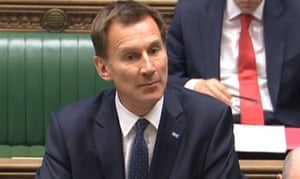
‘Indicator hopper’: Health secretary Jeremy Hunt. Photograph: PA
Use total numbers rather than proportions (or whichever way suits your argument)
In the final three months of 2014, less than 93% of attendances at Accident and Emergency units were seen within four hours, the lowest proportion for 10 years. And yet Jeremy Hunt managed to tweet that “More patients than ever being seen in less than four hours”. Which, strictly speaking, was correct, but only because more people were attending A&E than ever before. Similarly, when it comes to employment, an increasing population means that the number of employed can go up even when the employment rate goes down. Full Fact has shown how the political parties play “indicator hop”, picking whichever measure currently supports their argument.

Is crime going up or down? Don’t ask Andy Burnham. Photograph: PA
Don’t provide any relevant context
Last September shadow home secretary Andy Burnham declared that “crime is going up”, and when pressed pointed to the police recording more violent and sexual offences than the previous year. But police-recorded crime data were de-designated as “official” statistics by the UK Statistics Authority in 2014 as they were so unreliable: they depend strongly on what the public choose to report, and how the police choose to record it.
Instead the Crime Survey for England and Wales is the official source of data, as it records crimes that are not reported to the police. And the Crime Survey shows a steady reduction in crime for more than 20 years, and no evidence of an increase in violent and sexual offences last year.
Exaggerate the importance of a possibly illusory change
Next time you hear a politician boasting that unemployment has dropped by 30,000 over the previous quarter, just remember that this is an estimate based on a survey. And that estimate has a margin of error of +/- 80,000, meaning that unemployment may well have gone down, but it may have gone up – the best we can say is that it hasn’t changed very much, but that hardly makes a speech. And to be fair, the politician probably has no idea that this is an estimate and not a head count.
Serious youth crime has actually declined, but that’s not because of TKAP. Photograph: Action Press / Rex Features
Prematurely announce the success of a policy initiative using unofficial selected data
In June 2008, just a year after the start of the Tackling Knives Action Programme (TKAP), No 10 got the Home Office to issue a press release saying “the number of teenagers admitted to hospital for knife or sharp instrument wounding in nine… police force areas fell by 27% according to new figures published today”. But this used unchecked unofficial data, and was against the explicit advice of official statisticians. They got publicity, but also a serious telling-off from the UK Statistics Authority which accused No 10 of making an announcement that was “corrosive of public trust in official statistics”. The final conclusion about the TKAP was that serious youth violence had declined in the country, but no more in TKAP areas than elsewhere.

Donald Trump: ‘Am I going to check every statistic?’
Photograph: Robert F. Bukaty/AP
If all else fails, just make the numbers up
Last November, Donald Trump tweeted a recycled image that included the claim that “Whites killed by blacks – 81%”, citing “Crime Statistics Bureau – San Francisco”. The US fact-checking site Politifact identified this as completely fabricated – the “Bureau” did not exist, and the true figure is around 15%. When confronted with this, Trump shrugged and said, “Am I going to check every statistic?”
Not all politicians are so cavalier with statistics, and of course it’s completely reasonable for them to appeal to our feelings and values. But there are some serial offenders who conscript innocent numbers, purely to provide rhetorical flourish to their arguments.
We deserve to have statistical evidence presented in a fair and balanced way, and it’s only by public scrutiny and exposure that anything will ever change. There are noble efforts to dam the flood of naughty numbers. The BBC’s More or Less team take apart dodgy data, organisations such as Full Fact and Channel 4’s FactCheck expose flagrant abuses, the UK Statistics Authority write admonishing letters. The Royal Statistical Society offers statistical training for MPs, and the House of Commons library publishes a Statistical Literacy Guide: how to spot spin and inappropriate use of statistics.
They are all doing great work, but the shabby statistics keep on coming. Maybe these nine points can provide a checklist, or even the basis for a competition – how many points can your favourite minister score? In my angrier moments I feel that number abuse should be made a criminal offence. But that’s a law unlikely to be passed by politicians.
David Spiegelhalter is the Winton Professor of the Public Understanding of Risk at the University of Cambridge and president elect of the Royal Statistical Society
Tuesday, 23 April 2013
Beware the nostrums of economists

Politicians should not fall for the economic fad of the day. Policies should be subjected to democratic processes and be responsive to people’s aspirations
“The ideas of economists,” John Maynard Keynes famously wrote, “… are more powerful than is commonly understood. Indeed the world is ruled by little else.” He might have added that the ideas of economists can often be dangerous. Policies framed on the basis of the prevailing or dominant economic wisdom have often gone awry and the wisdom was later found to rest on shaky foundations.
A striking case in point is the debate on austerity in the Eurozone as an answer to rising public debt and faltering economic growth. One school has long argued that the way to reduce debt and raise the growth rate is through austerity, that is, steep cuts in public spending (and, in some cases, higher taxes). This school received a mighty boost from a paper published in 2010 by two economists, Carmen Reinhart and Kenneth Rogoff (RR). The paper is now at the centre of a roaring controversy amongst economists.
The RR paper showed that there is a correlation between an economy’s debt to GDP ratio. As the ratio rises from one range to another, growth falls. Once the debt to GDP ratio rises beyond 90 per cent, growth falls sharply to -0.1 per cent. For some economists and also for policymakers in the Eurozone, this last finding provided an ‘aha’ moment.
CUTS IN SPENDING
Since public debt was clearly identified as the culprit, it needed to be brought down through cuts in spending. The IMF pushed this line in the bail-out packages it worked out for Greece and Portugal among others. The U.K. chose to become an exemplar of austerity of its own accord.
It now turns out that there was a computational error in the RR paper. Three economists at the University of Massachusetts at Amherst have produced a paper that shows that the effect of rising public debt is nowhere as drastic as RR made it out to be. At a debt to GDP ratio of 90 per cent, growth declines from an average of 3.2 per cent to 2.2 per cent, not from 2.8 per cent to -0.1 per cent, as RR had contended.
You could say that even the revised estimates show that growth does fall with rising GDP. However, as many commentators have pointed out, correlation is not causation. We cannot conclude from the data that high debt to GDP ratios are the cause of low growth. It could well be the other way round, namely, that low growth results in a high debt to GDP ratio.
There is a broad range of experience that suggests that high debt to GDP ratios are often self-correcting. Both the U.S. and the U.K. emerged from the Second World War with high debt to GDP ratios. These ratios fell as growth accelerated in the post-war years. India’s own debt to GDP ratio kept rising through the second half of the 1990s and the early noughties. As growth accelerated on the back of a global boom, the ratio fell sharply. The decline in the ratio did not happen because of expenditure compression, which the international agencies and some of our own economists had long urged.
NEEDED, RETHINK
The controversy over the RR paper should prompt serious rethinking on austerity in the Eurozone. Many economists have long argued that the sort of austerity that has been imposed on some of the Eurozone economies or that the U.K. has chosen to practise cannot deliver higher growth in the near future. It only condemns the people of those economies to a long period of pain.
The IMF itself has undergone a major conversion on this issue and is now pressing the U.K. to change course on austerity. Its chief economist, Olivier Blanchard, went so far as to warn that the U.K. Chancellor, George Osborne, was “playing with fire.” The IMF’s conversion came about late last year when it acknowledged that its own estimates of a crucial variable, the fiscal multiplier, had been incorrect. In its World Economic Outlook report published last October, the IMF included a box on the fiscal multiplier, which is the impact on output of a cut or increase in public spending (or an increase or reduction in taxes). The smaller the multiplier, the less costly, in terms of lost output, is fiscal consolidation. The IMF had earlier assumed a multiplier for 28 advanced economies of around 0.5. This would mean that for any cut in public spending of X, the impact on output would be less than X, so the debt to GDP ratio would fall.
REVISED ESTIMATE
The IMF now disclosed that, since the sub-prime crisis, the fiscal multipliers had been higher — in the range of 0.9 to 1.7. The revised estimate for the multiplier meant that fiscal consolidation would cause the debt to GDP ratio to rise — exactly the opposite of what policymakers in the Eurozone had blithely assumed. The people of Eurozone economies that have seen GDP shrink and unemployment soar are unlikely to be amused by the belated dawning of wisdom at the IMF.
This is not the first time the IMF has made a volte face on an important matter of economic policy. Before the East Asian crisis and for several years thereafter, the IMF was a strong votary of free flows of capital. During the East Asian crisis, many economists had pointed out that the case for free flows of capital position lacked a strong economic foundation, unlike the case for free trade. This did not prevent the IMF from peddling its prescription to the developing world. India and China refused to go along.
In 2010, the IMF discarded its hostility to capital controls. It said that countries would be justified in responding to temporary surges in capital flows. A year later, it took the position that countries would be justified in responding to capital surges of a permanent nature as well. Last December, it came out with a paper that declared that there was “no presumption that full liberalisation is an appropriate goal for all countries at all times.” The IMF’s realisation was a little late in the day for the East Asian economies and others whose banking systems have been disrupted by volatile capital flows.
Capital account convertibility is one instance of a fad in policy catching on even when it lacked a strong economic foundation. Another is privatisation, for which Margaret Thatcher has been eulogised in recent weeks. Thatcher’s leap into privatisation in the U.K. was driven by her conviction that the state needed to be pushed back. After privatisation became something of a wave, economists sought to find theoretical and empirical grounds for it and initially came out overwhelmingly in favour.
GRADUATED APPROACH
It took major mishaps in privatisation in places such as Russia and Eastern Europe for the conclusions to become rather more nuanced. Privatisation works in some countries, in some industries, and under conditions in which law and order, financial markets and corporate governance are sound. Moreover, partial privatisation — or what is called disinvestment — can be as effective as full privatisation. As in the case of capital account convertibility, India’s graduated approach to liberalisation has been vindicated. It is, perhaps, no coincidence that the fastest growing economies in the world until recently, China and India, did not embrace the conventional wisdom on privatisation.
Other fads have fallen by the wayside or are seen as less than infallible since the sub-prime crisis, and these relate to the financial sector. ‘Principles-based’ regulation is superior to ‘rule-based’ regulation. The central bank must confine itself to monetary policy and regulatory powers must be vested in a separate authority. Monetary policy must focus on inflation alone and must not worry about asset bubbles and financial stability. One can add to this list.
What lessons for policymaking can we derive from the changes in fashion amongst economists? Certainly, one is that politicians and policymakers must beware the nostrums of economists, and they must not fall for the economic fad of the day. Economic policies must always be subject to democratic processes and be responsive to the aspirations of people. Broad acceptability in the electorate must be the touchstone of economic policies. Another important lesson is that gradualism is preferable to ‘big bang’ reforms.
India’s attempts at liberalisation, one would venture to suggest, have conformed to these principles better than many attempted elsewhere. Such an approach can mean frustrating delays in decision-making and the results may be slow in coming. However, social turbulence is avoided, as are nasty surprises, in economic outcomes. At the end of the day, economic performance turns out to be more enduring.
(The author is a professor at IIM Ahmedabad; ttr@iimahd.ernet.in)
Subscribe to:
Posts (Atom)